

 BACK
BACK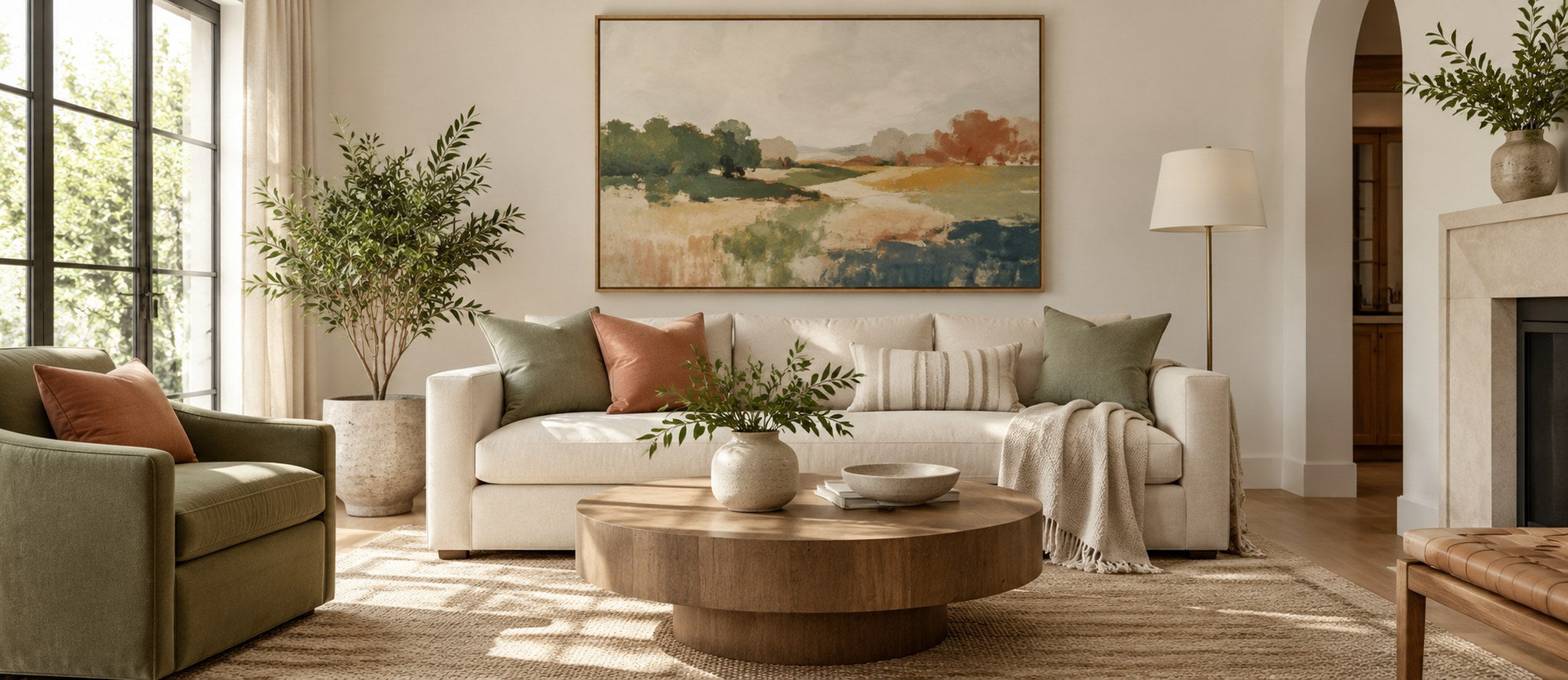

A neutral room does not have to feel colorless. In fact, soft whites, beige, taupe, cream, gray, and natural wood tones create one of the easiest foundations for introducing color because the quieter backdrop gives every accent more visual impact. The key is to add color with intention rather than scattering bright shades around the room. Start with one main accent family, repeat it in a few places, and let the neutral base keep the overall composition calm.
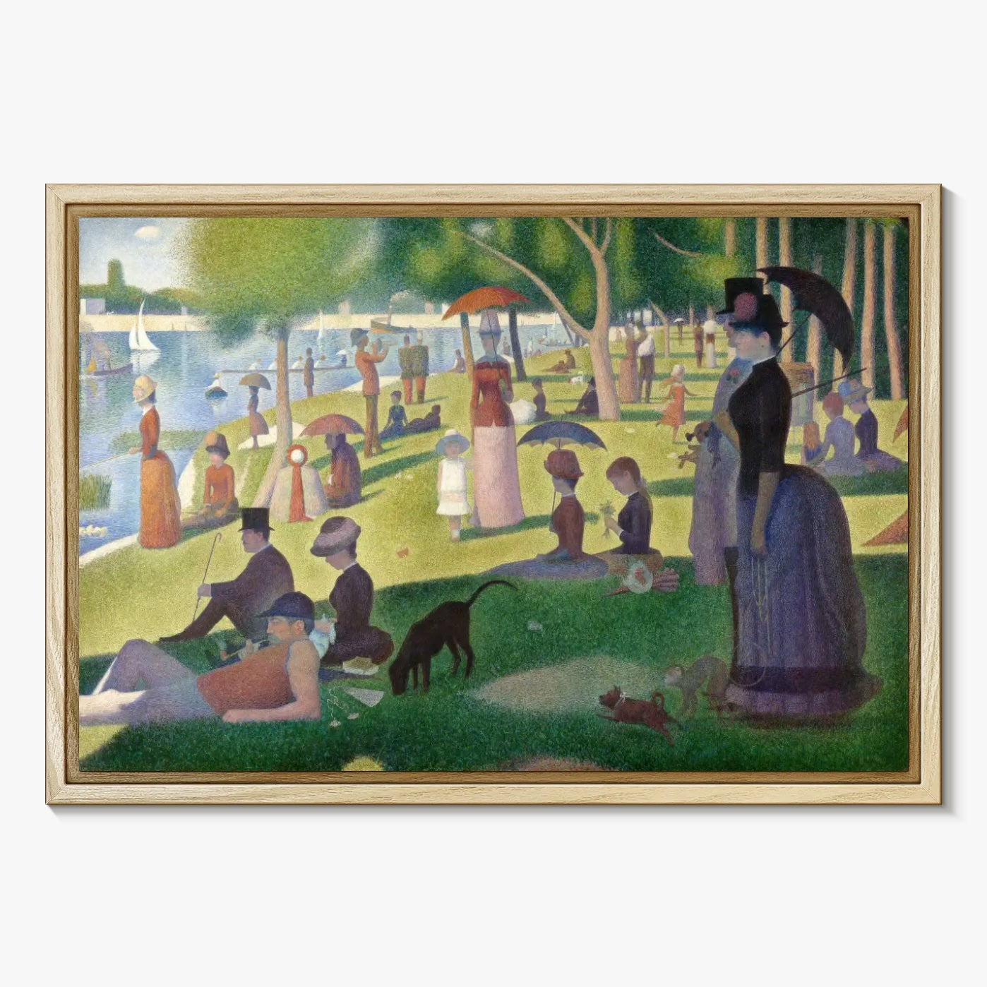
Artwork, textiles, paint, plants, and accessories can all introduce color without changing the character of a neutral interior. A bold abstract piece, a soft botanical print from the floral and botanical collection, or a more organic selection from nature artwork can become the starting point for the entire palette.
Navigate to a specific section:
- Choose an Accent Color
- Use Paint Strategically
- Layer Color Through Textiles
- Let Artwork Set the Palette
- Bring in Natural Color
- Ground the Room with Color
- Keep the Palette Balanced
Choose an Accent Color That Works with Your Neutrals

Before choosing a bright shade, look closely at the undertone of the room. Warm neutrals such as cream, camel, tan, and warm beige usually pair easily with terracotta, olive, ochre, burgundy, rust, and muted pink. Cooler neutrals such as crisp white, charcoal, blue-gray, and cool taupe can support cobalt, teal, forest green, lavender, and cooler reds.
You do not need to limit yourself to one exact color. Think in families instead. A room might combine sage, moss, and deep olive while still reading as a green-accented space. Another room may use dusty rose, clay, and wine tones. This layered approach feels more collected than matching every object to a single swatch. If you prefer a quieter result, minimalist abstract artwork can introduce controlled color without overwhelming the room.
Neutral Palette Bedroom Décor
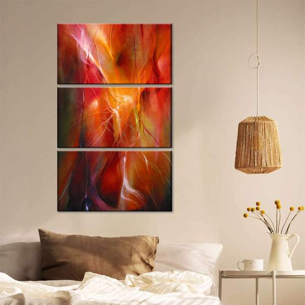
Bedrooms usually benefit from softer contrast. If the room is mostly beige or warm white, try muted blue, green, or rose in small doses. In a gray bedroom, warmer accents can prevent the scheme from feeling flat. A single framed art piece above the bed, paired with a throw or cushion in a related tone, is often enough to create cohesion.
Use Paint Strategically

An accent wall can work well when the room needs a stronger focal point, but it should connect to something else in the space. Pull the wall color from artwork, upholstery, a rug, or another feature so it feels intentional. In smaller rooms, saturated color can still work beautifully when it is balanced by enough light and open neutral surfaces. The goal is not to follow a rigid warm-versus-cool rule; it is to create contrast while preserving visual balance.
If painting a full wall feels like too much commitment, use color on a smaller architectural feature such as an alcove, built-in shelving, a door, or the back of a bookcase. You can then repeat the same hue in canvas art or decorative objects to connect the color story across the room.
Layer Color Through Textiles

Textiles are one of the easiest ways to test color because they can be changed without redesigning the room. Start with two or three pieces rather than adding every accent at once. A pillow, throw, and curtain detail in related tones can establish a palette while the sofa, walls, and larger furniture stay neutral.
Pattern is useful here because it can bridge several colors at once. A rug or cushion with a neutral base and two accent shades makes it easier to repeat those colors elsewhere. If you are unsure how much color to use, the 60-30-10 decorating rule is a helpful starting framework, but treat it as a guide rather than a formula. Rooms with layered neutrals often need less accent color than the rule suggests.
Use Curtains to Frame the Palette
Curtains occupy a large vertical area, so even a muted color can make a noticeable difference. For a subtle effect, choose drapery only a few shades stronger than the room's neutral base. For more contrast, pull a color from the artwork and use it in the curtains at a lower saturation. This keeps the room coordinated without looking overly matched.
Let Artwork Set the Palette

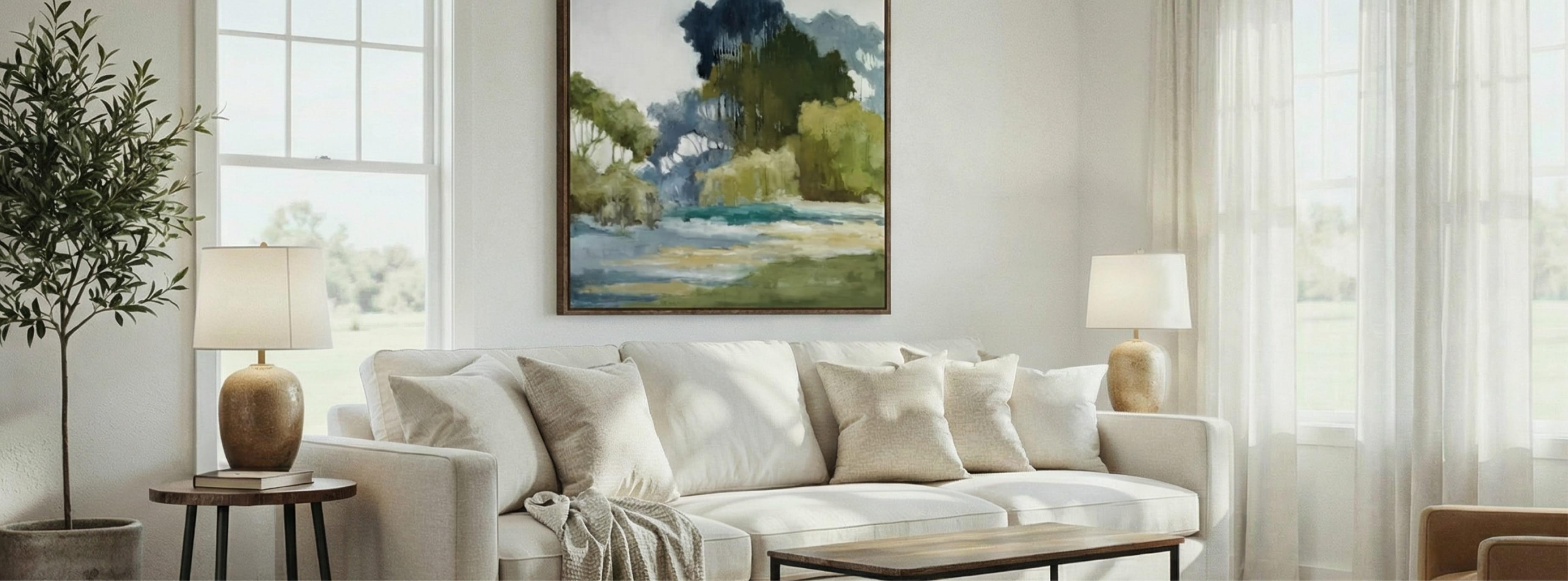
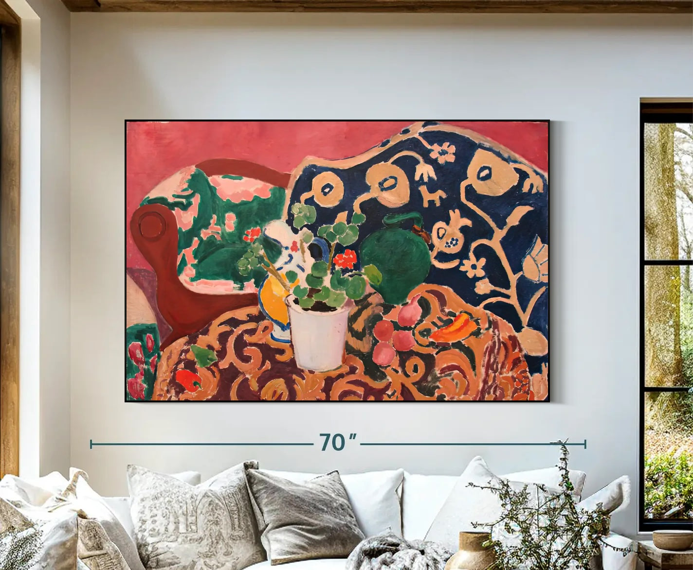
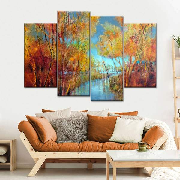
Artwork is especially useful in a neutral room because it can introduce several colors in one controlled focal point. Choose the piece first, then pull one or two hues from it for smaller accents around the room. For a modern look, explore abstract artwork. For a calmer organic direction, consider nature-inspired art or botanical designs.
Scale matters as much as color. A small piece on a large empty wall can feel disconnected, even if the palette is perfect. In spacious rooms or above wide furniture, large-scale artwork can create the focal point the room needs. In more traditional or polished interiors, framed canvas or framed pieces can add definition around the color.
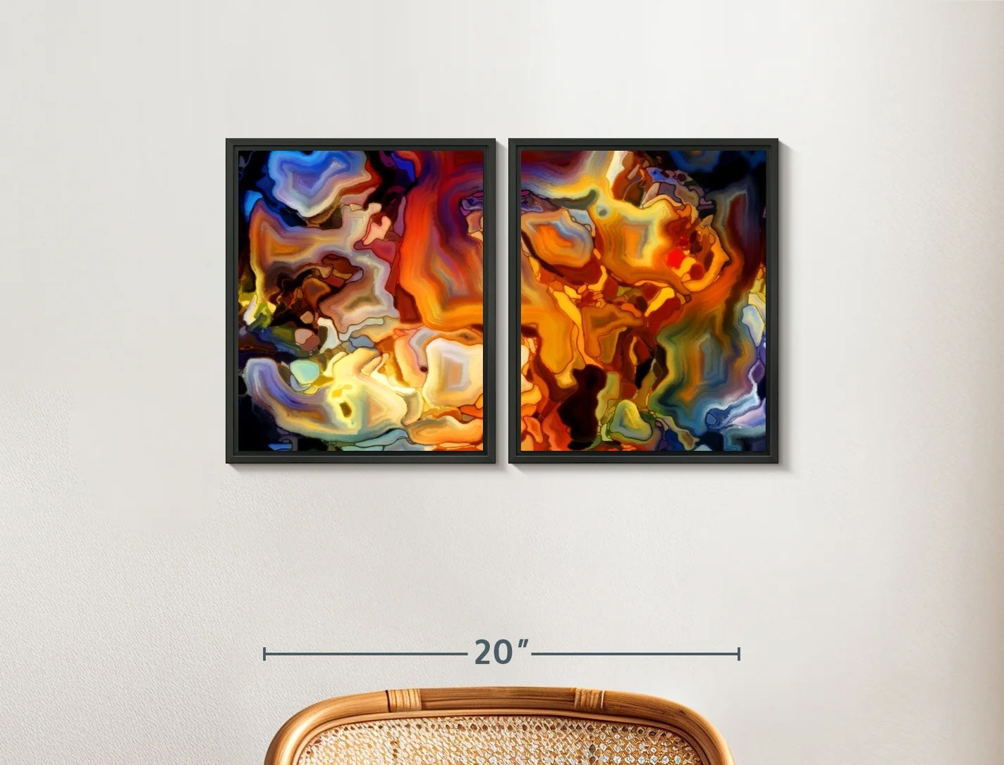
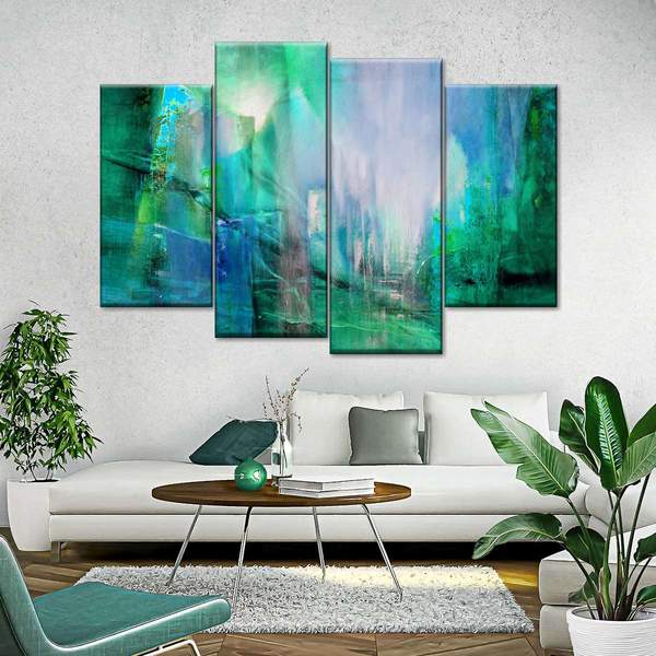
If one large statement piece is not right for the room, use art sets to spread color across a wider area. Keep enough visual breathing room between pieces so the arrangement still feels intentional. For more guidance on choosing the accent itself, see our guide on finding your ideal pop of color.
Bring in Natural Color

Greenery introduces color without making a neutral room feel heavily decorated. Plants work particularly well with beige, cream, warm gray, wood, stone, and other organic materials because the green feels connected to the natural palette rather than added on top of it. Repeat the effect with botanical artwork or a green-toned ceramic piece for a more layered look.
Fresh flowers can also create a temporary accent that changes with the season. If you prefer a coastal direction, soft blue-green accents can pair naturally with beach artwork or a restrained nautical piece. Keep the surrounding materials simple so the color remains the focus.
Ground the Room with Color

Rugs can introduce more color than small accessories while still keeping the palette flexible. In a neutral room, look for a rug that includes the wall or upholstery color plus one or two accent tones. That connection helps the rug feel integrated instead of separate from the rest of the room.
If the rug is patterned, keep nearby artwork somewhat simpler, or repeat only one of the rug's stronger colors in the artwork. If the rug is quiet, you have more freedom to use expressive canvas pieces or a bold focal artwork above the sofa or console.
Keep the Palette Balanced

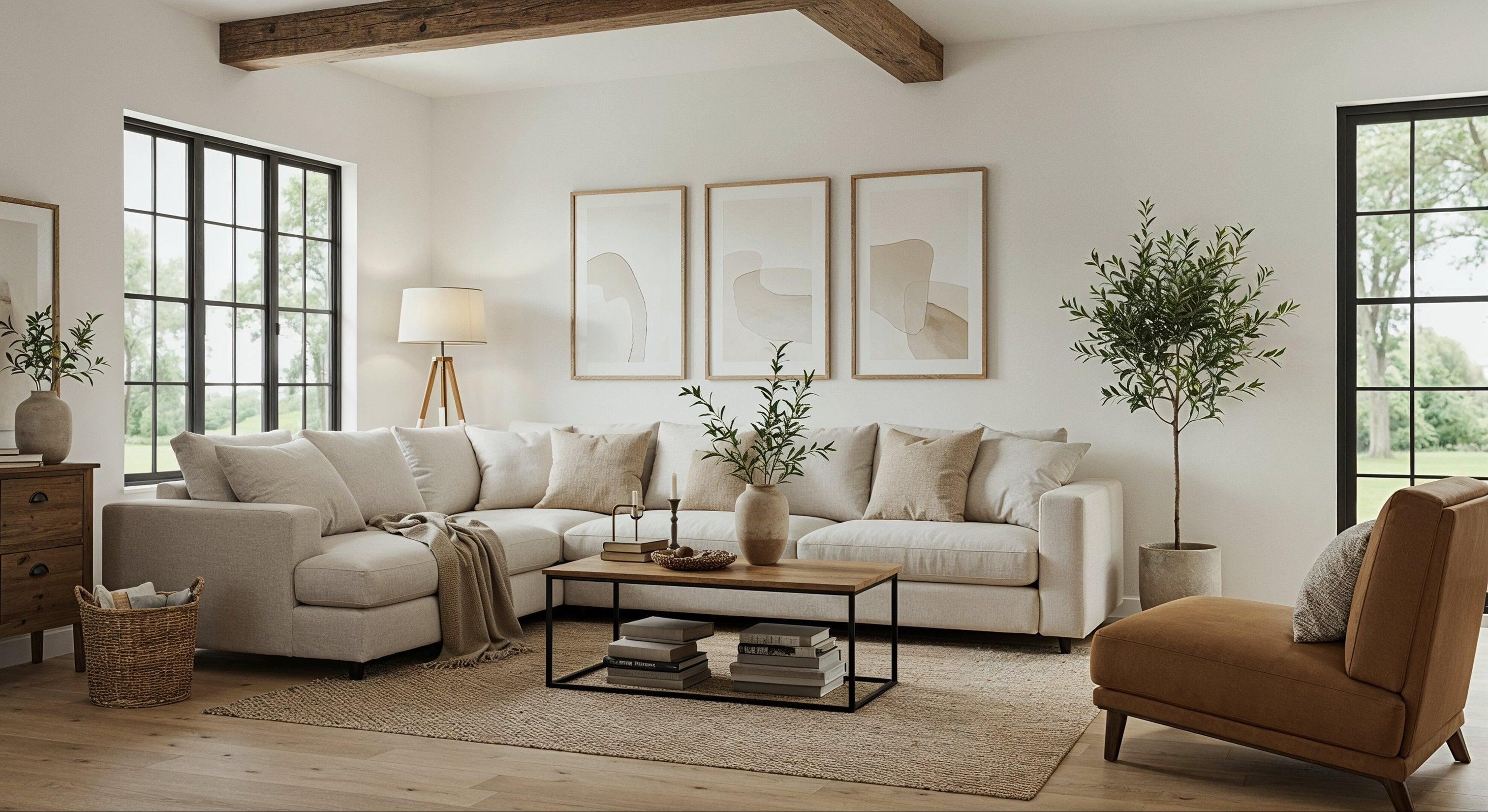
The most successful neutral rooms repeat accent color without repeating it identically. One shade might appear in a painting, a darker version in a cushion, and a softer version in a vase. Varying the tone creates depth while repetition makes the room feel connected.
Also pay attention to finish and texture. Matte textiles soften saturated color, while glossy ceramics or metallic accents make even a small amount of color feel more prominent. Natural materials such as linen, wool, wood, and stone help bridge the space between a quiet neutral base and stronger accents.
When you want the room to stay especially calm, look at the principles in our guide to creating a cool and calm color palette. The same approach works here: control contrast, repeat key tones, and allow some areas of the room to remain visually quiet.
Bringing Color Into Your Space
Adding color to a neutral palette is less about choosing the brightest shade and more about creating a clear visual hierarchy. Begin with the neutral foundation, choose one accent family, and repeat it through a few thoughtfully selected elements. Whether you use textiles, plants, paint, oversized artwork, or a coordinated art set, leave enough neutral space around the accents for them to stand out. The result should feel layered, personal, and balanced rather than busy.

RECENT ARTICLES




CATEGORIES

 GET OUR TIPS!
STRAIGHT TO YOUR INBOX


Follow Us


